
CACHAÇA MALANDRINHA
A cachaça é uma bebida com a cara do Brasil. É popular na sua essência, aquecendo festividades como rodas de samba e encontros com música brasileira. E o nome Malandrinha também tem tudo a ver com a essência da cachaça, já que a figura do Malandro está presente no imaginário do brasileiro, como alguém que tem a "malemolência" de curtir o que é bom.
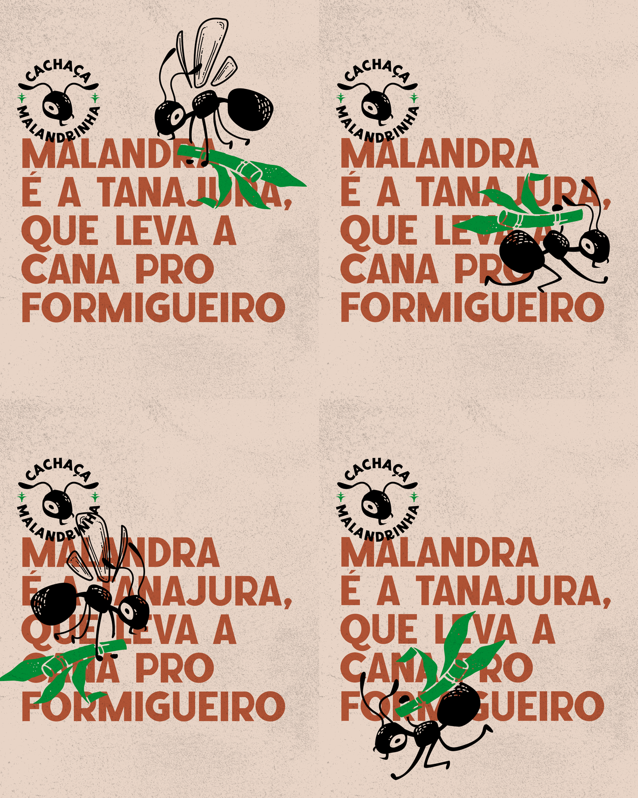
Mas faltava essa malemolência na marca da Cachaça Malandrinha e após pesquisarmos e entendermos com o cliente as peculiaridades da região de Viçosa do Ceará, local onde é produzida a cachaça, criamos uma personagem que nasceu da observação das formigas carregando folhas pra o formigueiro. Olhando pra natureza da região pensamos que, malandra é a Tanajura que carrega a folha de cana para dentro do seu formigueiro. Essa formiga tão típica da região passou a ser a nossa malandrinha que saboreia a base da cachaça.
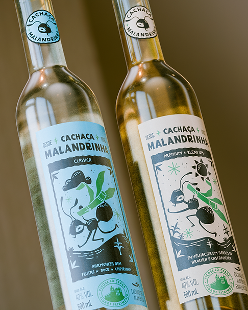
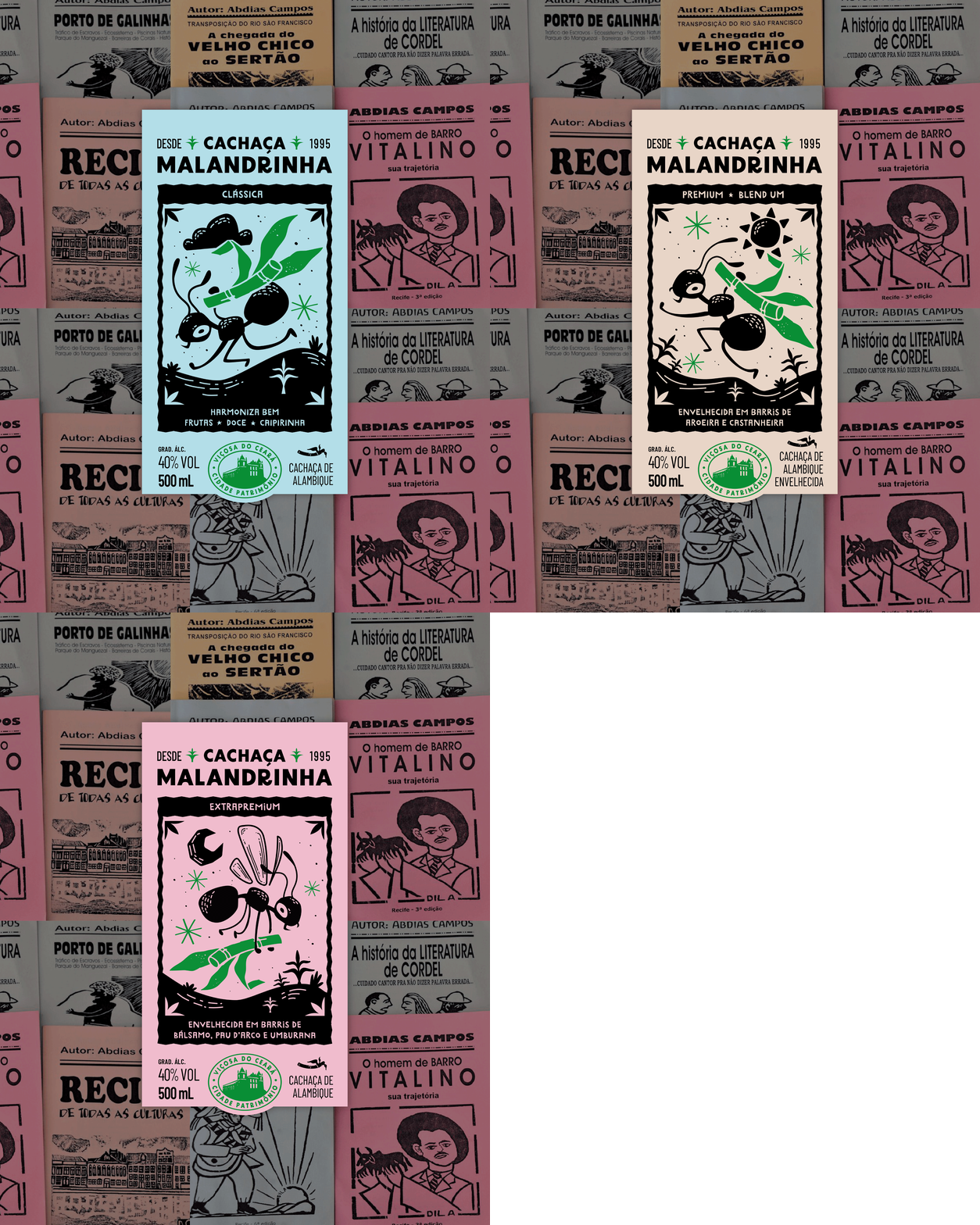
Para dar vida a essa personagem na marca e nos rótulos da cachaça, exploramos uma linguagem gráfica bem popular que é o estilo de xilogravura de histórias de cordel. Assim em cada rótulo a malandrinha está numa pose diferente levando sua cana pra casa. No projeto os rótulos são impressos em papeis com as cores das revistinhas de cordel e com aplicação de hot stamping verde nos elementos que lembram a cana.
Cachaça is a drink that truly embodies Brazil. It is popular at its core, bringing warmth to celebrations like samba circles and gatherings filled with Brazilian music. The name Malandrinha also perfectly reflects the essence of cachaça, as the figure of the malandro lives in the Brazilian imagination—someone with the effortless charm and “swing” to enjoy the good things in life.
However, this sense of malemolência was missing from the Cachaça Malandrinha brand. After researching and understanding with the client the unique characteristics of the Viçosa do Ceará region—where the cachaça is produced—we created a character inspired by observing ants carrying leaves back to their anthills. Looking at the region’s nature, we thought: the real “malandra” is the tanajura, the ant that carries sugarcane leaves into its nest. This ant, so typical of the region, became our Malandrinha, savoring the very essence of cachaça.
To bring this character to life across the brand and its labels, we explored a highly popular graphic language: the woodcut style of cordel literature. Each label features Malandrinha in a different pose, carrying her sugarcane home. The labels are printed on papers inspired by the colors of traditional cordel booklets, with green hot stamping applied to elements that evoke sugarcane.
CLIENTE / CLIENT
Cachaça Malandrinha
SEDE DA EMPRESA / COMPANY HEADQUARTERS
Viçosa do Ceará / CE - Brasil
DATA DO LANÇAMENTO / RELEASE DATE
Outubro 2025 / October 2025






SERVIÇOS / SERVICES
Redesenho de marca e identidade visual / Brand identity
Design de Embalagem / Packaging
NÉKTAR DESIGN TEAM
Creative Direction: Paula Langie
Account Executives: Paula Langie, Aline Reis
Design: Matheus Fritz, Gabriel Hoch Jaques
Illustrations: Julia Fraga, Gabriel Hoch Jaques
3D: Vithor Borges
©2026 by Néktar Design