
ÁGUA HORTÊNSIAS
Ao completar 10 anos no mercado, a Água Hortênsias sentiu a necessidade de expressar sua maturidade de marca em um posicionamento claro e uma nova identidade. Para destacar a empresa em um mercado de comodities como o de água mineral, a Néktar desenvolveu um projeto de rebranding que partiu de uma fase de pesquisa e um profundo entendimento da história da marca e seu principal diferencial: sua origem nas montanhas verdes da Serra Gaúcha.
Fundada em 2014, em Canela, a Água Hortênsias tem como propósito aproximar as pessoas de uma vida mais saudável, seja mantendo o corpo hidratado ou estimulando o contato com a natureza. Assim, criamos uma identidade visual que transmite a pureza da água que vem da extração de uma fonte perfurada na montanha e, ao mesmo tempo, a elegância da região das Hortênsias, que dá nome à empresa.
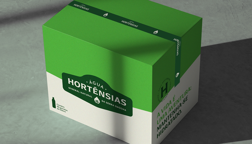
Há muitos anos utilizando o desenho de um ícone de montanhas no rótulo, nosso desafio foi manter a presença da serra, porém sem o uso desse ícone que é muito comum no setor. Por isso, a marca ganhou a aplicação de um selo cuja curvatura remete aos altos morros verdes da região. Reconhecida pela forte influência europeia, a elegância da Serra Gaúcha está presente com a escolha de fontes semi-serifadas na marca, um ícone que une o desenho de uma araucária com uma gota e o uso de um selo redondo com a letra H em destaque.
Upon completing 10 years in the market, Água Hortênsias felt the need to express its brand maturity through a clear positioning and a new identity. To highlight the company in a commodity market such as mineral water, Néktar developed a rebranding project that began with a research phase and a deep understanding of the brand’s history and its main differentiator: its origin in the green mountains of Serra Gaúcha.
Founded in 2014 in Canela, Água Hortênsias aims to bring people closer to a healthier lifestyle, whether by keeping the body hydrated or encouraging contact with nature. With this in mind, we created a visual identity that conveys the purity of water sourced from a drilled spring in the mountains, while also reflecting the elegance of the Hortênsias region, which gives the company its name.
Having used a mountain icon on its label for many years, our challenge was to maintain the presence of the mountains without relying on this symbol, which is very common in the industry. Therefore, the brand adopted a seal whose curvature evokes the region’s high green hills. Known for its strong European influence, the elegance of Serra Gaúcha is also expressed through the use of semi-serif typefaces, an icon that combines the shape of an araucaria tree with a water drop, and a round seal featuring the letter “H” in prominence.
SEDE DA EMPRESA / COMPANY HEADQUARTERS
Água Hortênsias
SEDE DA EMPRESA / COMPANY HEADQUARTERS
Canela / RS - Brasil
DATA DO LANÇAMENTO / RELEASE DATE
Setembro 2025 / September 2025


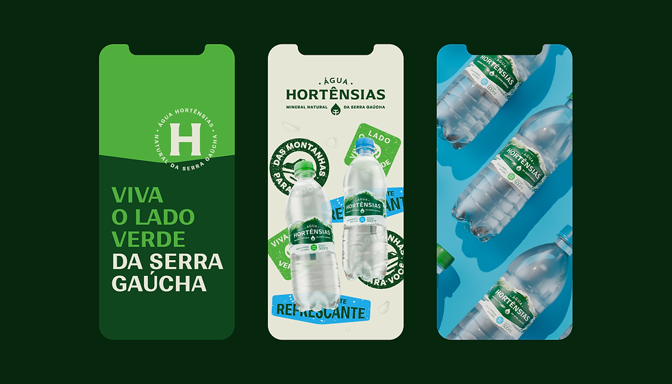
A embalagem é o carro-chefe do projeto de rebranding. Como principal ponto de contato da marca com os consumidores, nosso foco foi trazer mais presença nas prateleiras, sem aumentar os custos de produção atuais da empresa. Para isso, era pré-requisito do projeto mantermos o mesmo shape da garrafa, inovando no rótulo e nas tampinhas. A partir do conceito “Viva o lado verde da Serra Gaúcha”, a estratégia dos novos rótulos foi de usar uma ilustração de paisagem da serra, com acabamentos irregulares nas extremidades dando um tom mais rústico, aplicados sobre o fundo transparente que deu um aspecto de pureza e frescor para o novo rótulo. As cores das tampinhas diferenciam as versões com e sem gás, com a impressão do selo da letra H em destaque. Além disso, o uso do selo verde da marca manteve o formato das montanhas do rótulo azul antigo, que era muito reconhecido no mercado gaúcho.
The packaging is the centerpiece of the rebranding project. As the brand’s main point of contact with consumers, our focus was to increase its presence on the shelves without raising the company’s current production costs. To achieve this, it was essential to keep the same bottle shape, innovating instead through the label and the caps. Based on the concept “Experience the green side of Serra Gaúcha,” the strategy for the new labels was to use a landscape illustration of the mountains, with irregular edges that give it a more rustic feel, applied over a transparent background to convey a sense of purity and freshness. The cap colors differentiate the still and sparkling versions, featuring the “H” seal prominently printed on top. In addition, the use of the brand’s green seal preserves the mountain shape from the previous blue label, which was widely recognized in the local market.




SERVIÇOS / SERVICES
Redesenho de marca e identidade visual / Brand identity
Design de Embalagem / Packaging
Comunicação / Communication
NÉKTAR DESIGN TEAM
Account Executives: Paula Langie, Aline Reis
Creative Direction: Paula Langie
Strategic Direction: Roberta Anacleto
Design: Gabriel Hoch Jaques, Patricia Ugalde, Matheus Fritz, Guto Santos
Copywriting: Paulen Renck, Maria Eduarda Loh
3D & Motion: Vithor Borges
©2026 by Néktar Design